Pages

Blog post updated : no update

Saturday, March 29, 2008

Vector Illustration - Glory days

[ Download | 1024x768 ]

Hmm..this is the very first time I designing something like this. I know its not looking very good though. I visited a lot of design blog/website everyday and see their artworks including these funky design. I told to myself -> Ohh..that was really easy.

But when I'm trying to design it by myself, my head start spinning in the air. Yes, it quite hard if you're a newbie like me. You've to consider a lot of things - elements to use, colors, shapes, placement, typography, theme and so on..

So in this illustration, I've use the sunburst shape as the background and the purplish colors as well. Maybe in the next tutorial section I will tell you how do I created the sunburst effect. So don't forget to get a free updates via my blog feed or email. Hehe..

Vector illustration details:-

Name: Glory Days
Type: Vector Illustration
File Format: JPEG
Dimensions: 1024 x 768
Theme: Funky
File size: 707 KB
Date created: March 29, 08
Software: Adobe Illustrator CS
Color: Purple, Red, Orange, Yellow, White
Background Color:
  • HEX: #330033
  • RGB: 51, 0, 51
Extract the file using WinZip.

Saturday, March 22, 2008

Illustrator tutorial - Trendy circles

Update: I've uploaded a new trendy circles final image on Flickr along with the sunburst shape and the abstract wave shape. :)


Well, I see lots of cool design elements have been applied by the graphics designer lately. And one of them is the “trendy circles”. So, today we’ll learn how to draw and simply apply a color to it. It was a simple tutorial anyway and maybe it will be useful for your design element in the future.

Software: Adobe Illustrator CS

Step 1

Create New Document with any Artboard setup and select RGB color for Color Mode. I used 500px x 500px setting in this tutorial.


Step2

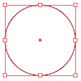
Select the Ellipse Tool (or just press L). Click once anywhere on the artboard and enter Width:100px, Height: 100px. OK.


Step 3

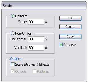
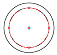
While the circle is on selected, double click the Scale Tool. Enter Uniform Scale: 80, click Copy.


And you’ll get something like this:-


Step 4

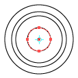
Repeat Step 3 twice. For the Uniform Scale, enter 85 and another one 50. You should have a circles shape like below:-


Step 5

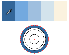
Now we gonna give some colors for this circles. Simply visit COLOURLovers to find the desired color palette. As for this tutorial I’ve chose the color palette that called Daytona.

Drag the color palette image directly from your browser and drop it on your artboard.


Step 6

Start coloring. By using the Eyedropper Tool (I), this job has come in handy. Click the Selection Tool (black arrow) or just press V to select the circle, click the Eyedropper Tool or just press I and then click at the color palette. The black stroke color will automatically disappear once you apply this tool.



Step 7

Make two duplicates of our complete colored circle. To duplicate, simply select all circles, press Alt/Opt key and drag it to the bottom or anywhere on the artboard.

Ok, now you have 3 trendy circles. By the way, its not look really sweet with the same color applied on it.

So next, start coloring the other two circles. But this time, change the order of the color you applied on it by using the same color palette. E.g. If you’ve used the dark blue on the first circle, try to change it to light blue color.

Once you done, select each of our completed colored circle and group it (Object > Group or Ctrl/Cmd + G)

This is what I did to my circles:-
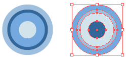


Now you have three trendy circles and ready to be applying on any of your artworks (blog header, poster, etc.). At this point, you either can resize them to make it bigger or smaller, manipulate them using the effect tool, make them a symbol (to use it later) or anything that suits your design.

Continue to next step if you’d like to know how I use them to make the image (on top of this post) for this tutorial.


Step 8

Select the Rounded Rectangle Tool and click once anywhere on your artboard. Enter Width: 350px, Height: 250px and Corner Radius: 100. Fill it with dark blue color (#405E8A or 61, 94, 138 for RGB) with no stroke.
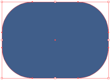


Right click the rounded rectangle > Arrange > Send to Back or just press Ctrl/cmd + Shift + [.


Step 9

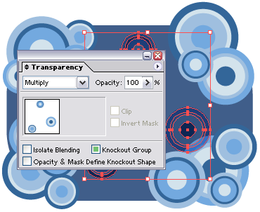
Make 10 to 15 duplicates of our trendy circles. Resize them to make it medium size and smaller. Press Shift key while resizing them.

Then, using your creativity, place them together around of our rounded rectangle.

Select two or three of them, set the Transparency (Shift + F10): Multiply.


Step 10

Select all of our graphics. Go to Object > Group. Press Alt/Opt key and drag it to the bottom to make a duplicate.

Right click on our duplicate graphics > Ungroup or just press Shift + Ctrl/Cmd + G.

While the ungroup duplicate graphics is on selected click the Add to shape area at Pathfinder palette (Shift + F9).
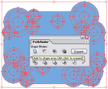


And just right after that, click the Expand button on the right side of it. You should have one big shape right now.


Step 11

Fill it with dark blue color (#405E8A or 61, 94, 138 for RGB) with no stroke.

Press V to select the shape. Go to Object > Path > Offset Path…Enter Offset: 10px, Joins: Miter, Miter Limit: 4.

Fill the offset path with light blue color (#E8ECF3 or 232, 246, 243 for RGB)

Then go to Effect > Stylize > Drop Shadow…Enter X Offset: 1px, Y Offset: 1px, leave everything as default and click OK.
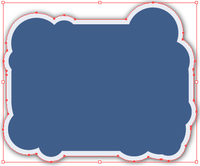


Select both of the offset path and the original shape. Go to Object > Group. And then right click > Arrange > Send to Back.


Step 12

Ok. Last but not least. Select both of our graphics, the trendy circles and the duplicate shape with shadow. Click the Horizontal Align Center and Vertical Align Center on Align palette (Window > Align or Shift + F7). Done.
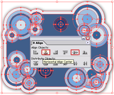


Add some text, logo or anything.

Our final result:-


Yeahh…that’s all for today. Be creative and impress your friends. Hope you guys enjoy this tutorial!!

Saturday, March 15, 2008

Nokia Morph

Guys, I really want this stuff. It's a cool device by Nokia that called The Morph. By using the nanotechnology concept, this device can enables its materials and components to be flexible, stretchable, transparent and remarkably strong. By the way, check out this video to see the concept of this device:-


Visit Dexigner website for further reading.

That all for today!!

Saturday, March 8, 2008

Illustrator tutorial - Draw a flower


In this tutorial, I’ll show you how to draw a flower easily using the Distort and Transform effect in Illustrator. And guess what, there is totally no pen tool involved along this tutorial! This is the trick that I used to draw the Illustrator CS icon (not really looks like it). Somehow it also looks like a Sunflower for me. Hmm..

Software : Adobe Illustrator CS

Step 1

Create a New Document with 500px x 500px Artboard Setup. Select RGB color for Color Mode.


Step 2

Select the Polygon Tool. Click once at the artboard and enter Radius: 70, Sides: 10.
Just fill it with black color first with no stroke.


Step 3

Go to Effect > Distort and Transform > Pucker and Bloat…Enter 50 and OK.


Step 4

Go to Effect > Distort and Transform >Roughen…Enter Size: 10, Relative, Detail: 0 and Points: Smooth. Press OK. You’ll get something like this:-


Step 5

Apply a green Radial Gradient (F9) on it as below:-


Click the left slider and set Location: 50. It’s done for the first layer of our petals.


Step 6

Click on Polygon Tool once again. Enter Radius: 50, Sides: 15. Go to Effect > Distort and Transform > Pucker and Bloat…Enter 100 and OK.

You’ll get something like below:-


The Gradient effect will be automatically applied on it. Change the left slider Location: 30.

Then go to Effect > Distort and Transform > Tweak…Enter Horizontal: 10, Vertical: 10, Relative, Anchor Points: Unchecked, “In” Control Points: Checked and “Out” Control Points: Checked. Click Preview to know how its look and click OK.


Place our second petals in front of the first one:-


Step 7

Repeat Step 6 to create the next petals. Enter these values.

Polygon Tool, Radius: 30, Sides: 15.

Pucker and Bloat: 100 and

Tweak, Horizontal: 20, Vertical: 20, Relative, Anchor Points: Unchecked, “In” Control Points: Checked and “Out” Control Points: Checked. Click OK.

Set the Gradient left slider Location: 15.


And place it in front of our second petals.


Step 8

Ok, the last one. Select the Ellipse Tool or just press L. Click once on the artboard and enter Width: 40px, Height: 40px and click OK.


Then go to Effect > Distort and Transform > Zig Zag…Enter Size: 15, Absolute, Ridges per segment: 20 and Points: Smooth.


After that, go to Effect > Distort and Transform > Roughen… Enter Size: 5, Relative, Detail: 5 and Points: Corner.

Set its Gradient left slider Location: 20.


And place it in front of our third petals. Select all petals, go Object > Group.


Done for the flower.


Step 9

Select the Rounded Rectangle Tool. Click once on the artboard and enter Width: 300px, Height: 250px and Radius: 20.

Fill it with white color with no stroke.

Go to Effect > Stylize > Drop Shadow…Enter X Offset: 1px, Y Offset: 1px, leave everything as default as click OK.


Step 10

Right click the Rounded Rectangle > Arrange > Send to Back or just press Ctrl+Shift+[.

Place our flower to the bottom-left of the rectangle. Make the duplicate of our flower. Resize to make it bigger. Press Shift key while resizing it. Then, set Transparency (Shift+F10): Multiply and Opacity: 30.

Make another three or five duplicates and resize it to make it smaller. Place it on the top-right and bottom-right or anywhere that suits you.

Our final result:-


The flower with some other color settings:-


I hope you guys enjoy this tutorial and that’s all for today. Yeahh!!!

Tuesday, March 4, 2008

Music using only sounds from Windows XP and 98

Got this from digg. Check it out!


another one...

 
Powered by Blogger