Sometime you will found out that on some cases you cannot reset your monitor power option, hibernate option and other settings in the power options button. This thing happen when your laptop/pc is using the OEM's version of powercfg.cpl.
You may able to click the button, however it will just have a little bit blink on the top of your Start menu button.
To get rid of any non standard powercfg.cpl alternatives, just go to
HKEY_LOCAL_MACHINE\SOFTWARE\Microsoft\Windows\CurrentVersion\Controls Folder\Power
and rename the "shellex" subfolder once you have there to something little bit different, such as
"shellex.NEVER" or "shellex.RENAMED".
From now on Windows will use its powercfg.cpl instead of your OEM's version.
Should you revert, just rename the shellex key back.
Friday, April 23, 2010
Tuesday, April 13, 2010
FileID - Check file type/extension
Maybe sometime you've downloaded some file attachments from email or link provided by your friends and suddenly is does not have an extensions!!! So how to detect or check file extension? I just found these 2 useful softwares for you to grab:-
Saturday, May 24, 2008
Customize your own Swatches palette in Illustrator
Ok, just a simple Illustrator tip for today. Maybe some of you have been wondering on how to create your own color or swatches palette in Illustrator. This tip is useful whenever you’d like to use other custom colors for your shape over and over again. Besides, it will come in handy when you want to use it as your gradient colors.
This is how it’s done.
Step 1
Open your Illustrator program and go to Swatches palette (Window > Swatches). By default, Illustrator will open up your Default_RGB / Default_CMYK palette in your Swatch Library.
Step 2
Start deleting some colors that you never use. Select one color and then press Ctrl/Cmd key to select other colors. Press the Bin icon on bottom right to delete it. Click Yes if you see a message box.
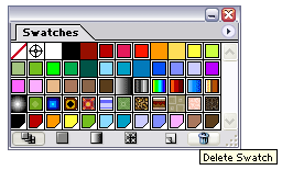
You’ll get something like this.
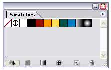
Note: There is no need to worry when you’ve deleted those colors because you can load them again by pressing the arrow button on the top right > Open Swatch Library > Default_RGB / Default_CMYK.
Step 3
Now visit any website on the net that offer free color palettes to get your desired color. For example, COLOURLovers website. Drag the color palette image directly from your browser into your artboard.
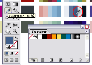
Step 4
Now by using the Eyedropper tool, our job has come in handy. Select the Eyedropper Tool or just press I and then click to the color palette image.
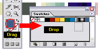
Step 5
After that, just drag the color from your Fill tool and drop it directly to your Swatches palette. That’s all, the trick!
Step 6
Repeat Step 5 to add other colors. Click the arrow icon on the top right > Save Swatch Library... Just save it as myswatches.ai and done.
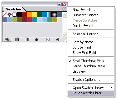
To use it soon or later, you have to load it on Open Swatch Library > myswatches.ai. Now, it’s really easy to add another color when you want to use the gradient tool.
That’s all for today and hope you enjoy this tip. Yeahh!!!
This is how it’s done.
Step 1
Open your Illustrator program and go to Swatches palette (Window > Swatches). By default, Illustrator will open up your Default_RGB / Default_CMYK palette in your Swatch Library.
Step 2
Start deleting some colors that you never use. Select one color and then press Ctrl/Cmd key to select other colors. Press the Bin icon on bottom right to delete it. Click Yes if you see a message box.
You’ll get something like this.
Note: There is no need to worry when you’ve deleted those colors because you can load them again by pressing the arrow button on the top right > Open Swatch Library > Default_RGB / Default_CMYK.
Step 3
Now visit any website on the net that offer free color palettes to get your desired color. For example, COLOURLovers website. Drag the color palette image directly from your browser into your artboard.
Step 4
Now by using the Eyedropper tool, our job has come in handy. Select the Eyedropper Tool or just press I and then click to the color palette image.
Step 5
After that, just drag the color from your Fill tool and drop it directly to your Swatches palette. That’s all, the trick!
Step 6
Repeat Step 5 to add other colors. Click the arrow icon on the top right > Save Swatch Library... Just save it as myswatches.ai and done.
To use it soon or later, you have to load it on Open Swatch Library > myswatches.ai. Now, it’s really easy to add another color when you want to use the gradient tool.
That’s all for today and hope you enjoy this tip. Yeahh!!!
Saturday, May 17, 2008
Illustrator tutorial - Abstract colorful waves
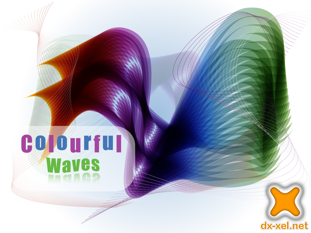
Click image to view a full size.
Abstract design was really great. Its created a unique experience in the eyes of designers and a different impressions among the people who saw the design. And today, we will learn on how to create the abstract colorful waves in Illustrator using the Blend technique. This is a good practice for a newbie out there as we’re using a pen tool in this tutorial.:)
Software: Adobe Illustrator CS
Step 1
Create New Document with any Artboard setup and select RGB Color for Color Mode. As for this tutorial, I used 1024px x 768px setting.
Step 2
Let’s get started by creating a simple radial gradient background. Select Rectangle Tool or just press M and click once anywhere on the artboard. You’ll see a popup window and enter Width: 1024px and Height: 768px (depends on your artboard setting) and OK.
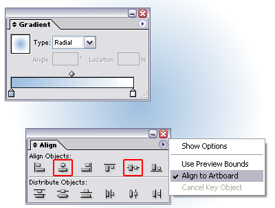
Apply a gradient color on it by clicking this tool and remove the stroke color. Go to Gradient palette (F9), set to Type: Radial and blue (#9FBFDF or 159, 191, 223) to white gradient.
Go to Align palette (Shift+F7) , click on Horizontal Align Center and Vertical Align Center. Make sure you select Align to artboard by pressing the arrow button beside it.
You may have something like below.
Note: My artboard size was scaled to 40% as Blogger will automatically resize my image to 400px x 400px :(
Step 3
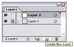
Go to Layers palette (F7) and lock Layer 1. Create New Layer.
Step 4
Grab your Pen Tool or press P and then set the stroke color to black and no fill color. Go to Stroke palette (F10) and set Weight: 30pt.
Draw two lines like below:-
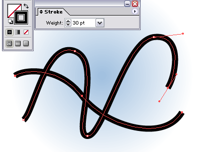
Pen tool tip: After drawing the first line, press Ctrl/Cmd and click outside the line area to release the anchor point connection and then draw the next line.
Note: It was ok if you don’t draw something as above. Remember, it’s just an abstract design and for newbie, just click and drag the pen tool on the artboard (I also did it before..hehe) to make a curve. Keep practice until you master the tool.
Step 5
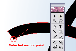
Select our two lines, go to Object > Expand. Just click OK if you see a message box.
Click on Direct Selection Tool or just press A. Go to the starting point of one of our line and select one anchor point right there.
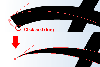
Click and drag the selected anchor point over the top of next anchor point beside it and release your click.
Step 6
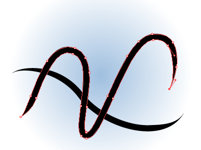
Repeat Step 5 to the other three starting and ending points of our line to create a sharp ending point. You should have something similar as below:-
Step 7
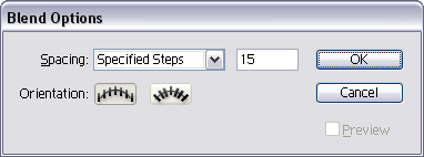
Press V and select both of our lines. Go to Object > Blend > Blend Options…Enter Spacing: Specified Steps and 15. OK.
Then go to Object > Blend > Make. You’ll get something similar as below:-
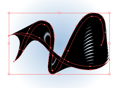
After that, go to Object > Expand and just press OK. Go to Object > Ungroup. Repeat this step (ungroup) until you cannot ungroup it anymore.
Step 8
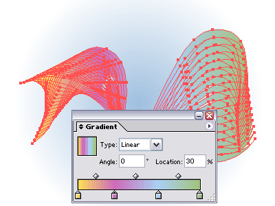
Now for the important part. Apply a linear gradient color onto this shape by clicking the color on Swatches palette (Window > Swatches) and dropping it to the Gradient palette (F9) - See my gradient tutorial in case you don’t know how to do it.
You may use any four colors (or more) to apply on it. Anyhow, I used these color settings Yellow (#FEDE58 or 254, 222, 88), purple (#CD6DBB or 205, 109, 187), blue (#A9CFF1 or 169, 207, 241) and green (#A3C380 or 163, 195, 128).
To see a magic, go to Transparency palette (Shift+F10) and set to Multiply.
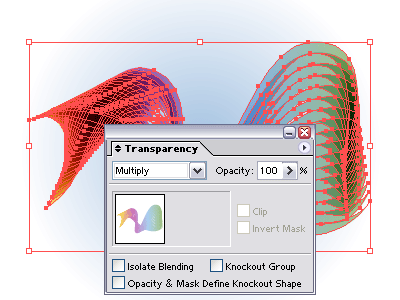
Woww! It looks great.
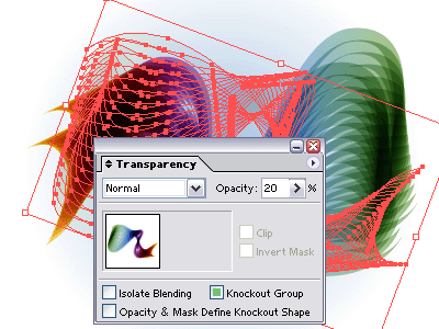
Step 9
Select all our shape and go to Object > Group. Make 2 or 3 duplicates and set Transparency Opacity 20%. Rotate or resize them using your creativity.
Step 10
Now, we’d like to create some supporting element into our shape. You might see how to create this shape on other website before.
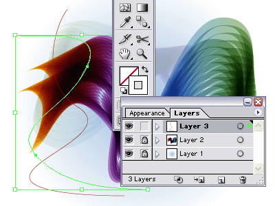
Lock Layer 2. Create New Layer.
Grab our Pen Tool (P) one more time and draw two lines like below. Apply a red color for the first line, white color for the second one and no fill color for both of them.
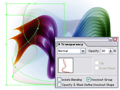
Go to Object > Blend > Make. Set the Transparency Opacity: 30.
Step 11
Ok, final step. Repeat Step 10 to create another one or two of our “wire wave” using different colors. Add some text, logo or anything into our design. Be creative and use your imagination.
Our final result:
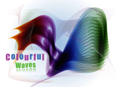
Click image to view a full size.
To be honest, I also never know how the "wave" would be looks like until it comes to Step no 8. I designed the image and wrote about it at the same time. Hehe..You may explore and experiment more on this technique, combine it with other effects and come out with more stunning results than me. Coz I’m pretty sure that you guys are a creative and most experience designer!
That’s all for today..Yeahh!!!
Software: Adobe Illustrator CS
Step 1
Create New Document with any Artboard setup and select RGB Color for Color Mode. As for this tutorial, I used 1024px x 768px setting.
Step 2
Let’s get started by creating a simple radial gradient background. Select Rectangle Tool or just press M and click once anywhere on the artboard. You’ll see a popup window and enter Width: 1024px and Height: 768px (depends on your artboard setting) and OK.
Apply a gradient color on it by clicking this tool
and remove the stroke color. Go to Gradient palette (F9), set to Type: Radial and blue (#9FBFDF or 159, 191, 223) to white gradient.Go to Align palette (Shift+F7) , click on Horizontal Align Center and Vertical Align Center. Make sure you select Align to artboard by pressing the arrow button beside it.
You may have something like below.
Note: My artboard size was scaled to 40% as Blogger will automatically resize my image to 400px x 400px :(
Step 3
Go to Layers palette (F7) and lock Layer 1. Create New Layer.
Step 4
Grab your Pen Tool or press P and then set the stroke color to black and no fill color. Go to Stroke palette (F10) and set Weight: 30pt.
Draw two lines like below:-
Pen tool tip: After drawing the first line, press Ctrl/Cmd and click outside the line area to release the anchor point connection and then draw the next line.
Note: It was ok if you don’t draw something as above. Remember, it’s just an abstract design and for newbie, just click and drag the pen tool on the artboard (I also did it before..hehe) to make a curve. Keep practice until you master the tool.
Step 5
Select our two lines, go to Object > Expand. Just click OK if you see a message box.
Click on Direct Selection Tool or just press A. Go to the starting point of one of our line and select one anchor point right there.
Click and drag the selected anchor point over the top of next anchor point beside it and release your click.
Step 6
Repeat Step 5 to the other three starting and ending points of our line to create a sharp ending point. You should have something similar as below:-
Step 7
Press V and select both of our lines. Go to Object > Blend > Blend Options…Enter Spacing: Specified Steps and 15. OK.
Then go to Object > Blend > Make. You’ll get something similar as below:-
After that, go to Object > Expand and just press OK. Go to Object > Ungroup. Repeat this step (ungroup) until you cannot ungroup it anymore.
Step 8
Now for the important part. Apply a linear gradient color onto this shape by clicking the color on Swatches palette (Window > Swatches) and dropping it to the Gradient palette (F9) - See my gradient tutorial in case you don’t know how to do it.
You may use any four colors (or more) to apply on it. Anyhow, I used these color settings Yellow (#FEDE58 or 254, 222, 88), purple (#CD6DBB or 205, 109, 187), blue (#A9CFF1 or 169, 207, 241) and green (#A3C380 or 163, 195, 128).
To see a magic, go to Transparency palette (Shift+F10) and set to Multiply.
Woww! It looks great.
Step 9
Select all our shape and go to Object > Group. Make 2 or 3 duplicates and set Transparency Opacity 20%. Rotate or resize them using your creativity.
Step 10
Now, we’d like to create some supporting element into our shape. You might see how to create this shape on other website before.
Lock Layer 2. Create New Layer.
Grab our Pen Tool (P) one more time and draw two lines like below. Apply a red color for the first line, white color for the second one and no fill color for both of them.
Go to Object > Blend > Make. Set the Transparency Opacity: 30.
Step 11
Ok, final step. Repeat Step 10 to create another one or two of our “wire wave” using different colors. Add some text, logo or anything into our design. Be creative and use your imagination.
Our final result:
Click image to view a full size.
To be honest, I also never know how the "wave" would be looks like until it comes to Step no 8. I designed the image and wrote about it at the same time. Hehe..You may explore and experiment more on this technique, combine it with other effects and come out with more stunning results than me. Coz I’m pretty sure that you guys are a creative and most experience designer!
That’s all for today..Yeahh!!!
Saturday, May 10, 2008
dx-xel.net’s new design
Fuhh…after struggling for over 1 month, so here it is, my new blog design. I called it Xel-white because it has a lot of white spaces. :) It’s maybe not my best design but I think that this layout is much better than the previous one (flat banner/logo, unattractive layout etc). Just my sense.
By the way, this time I’ve designed my new blog’s logo and added some illustration on the footer using the trendy circles element. I also have created my own web icons. Previously, I’ve used the FamFamFam Silk Icons.
Thus, there are really not many changes in the layout interface. I still prefer to use the 3 columns layout and the menu structure is remaining the same.
At first, I’d like to make a full illustration image for my blog banner. But, after thinking for a while that this blog is not fully a design blog, so I decided to make just a simple and plain banner as well. Maybe I need to create another blog and focus on design only. Hehe..
Other than that, I’ve also updated my archives, resources, about and contact page. I’ve to admit that I’m not really good when it comes to CSS. But so far, this layout is compatible with Firefox 2.0+, IE6 and Safari browser.
Until then, I hope you guys enjoy this new layout and some feedbacks are much appreciated.
That’s all. Yeahhh!!!
Saturday, April 26, 2008
3D Designs
Check out this cool videos that I just found on Youtube. Hehe..
3d Design
Yume Ninja - Ayame Project 2006
Besides, you might interested to view my previous post on cool new technology using 3D display.
That's all for today!! Yeahh!!!
3d Design
Yume Ninja - Ayame Project 2006
Besides, you might interested to view my previous post on cool new technology using 3D display.
That's all for today!! Yeahh!!!
Saturday, April 19, 2008
Vector logo - Green leaf

Hmm..I don't know what to do today so I open up the Illustrator program and designed this logo. It's just a simple vector logo anyway. Well, I also never know why do I post a lots about Illustrator lately (it's a tech blog for sure..hehe). By the way, if you have any suggestion or a request on my ai tutorials section, feel free to drop me a line.
Vector logo details:-
Name: Green Leaf
Type: Vector Logo Design
Theme: Nature
Date created: April 19, 08
Software: Adobe Illustrator CS
Color: Green, #66BA44 or 102, 186, 68
That all..yeah!!!
Vector logo details:-
Name: Green Leaf
Type: Vector Logo Design
Theme: Nature
Date created: April 19, 08
Software: Adobe Illustrator CS
Color: Green, #66BA44 or 102, 186, 68
That all..yeah!!!
Saturday, April 12, 2008
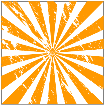
Illustrator tutorial - Grunge sunburst effect
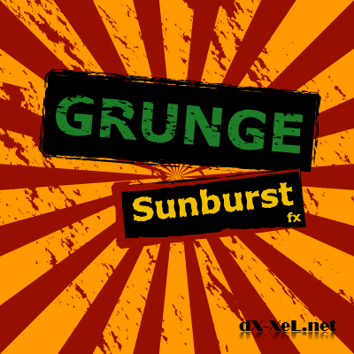
As promised before, today I’ll show you how to draw the sunburst shape and apply the grunge effect on it as well. Then, we will learn on how to save our sunburst shape to symbol so that you’ll never need to create them over and over again. And finally, I will show you a little tricks how to apply the grunge effect on text. Anyhow, here we go.
Software: Adobe Illustrator CS
Step 1
Create a New Document with 500px x 500px setting. Select RGB Color for Color Mode.
Go to View > Snap to Grid (Shift + Command/Ctrl + ").
Step 2
Select the Rectangle Tool or press M and click once anywhere on the artboard. You’ll see a popup window. Enter Width: 400px, Height: 400px. Fill it with a white color and a black stroke color.
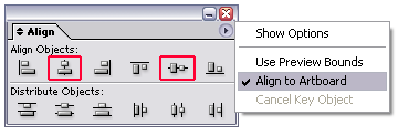
Align our rectangle to the center of our artboard using the Align palette (Shift + F7). Make sure you select the Align to Artboard in order to make it work.
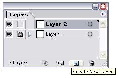
Go to the Layers palette (F7) and lock Layer 1. Create new layer.
Step 3
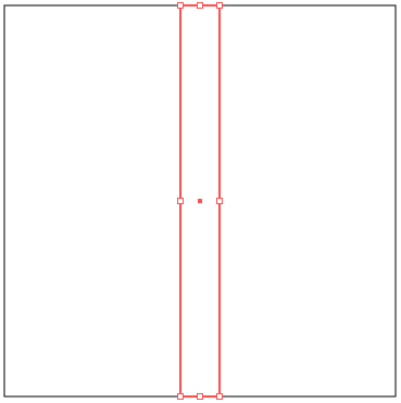
Repeat Step 2 to draw another rectangle. Enter Width: 40px and Height: 400px. Also, align it to the center. And this time just apply a black stroke color on it without a fill color.
Step 4
Go to Effect > Distort & Transform > Free Distort…What we're trying to do right here is to switch the position of our bottom-left point and the bottom-right point. To do this, click and drag the bottom-right point to the bottom-left point. After that click and drag the bottom-left point to the bottom-right point. You’ll have something like this:-
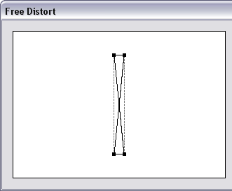
Click OK. Then go to Object > Expand Appearance.
Step 5
Double click the Rotate Tool. Enter Angle: -20 and click Copy.
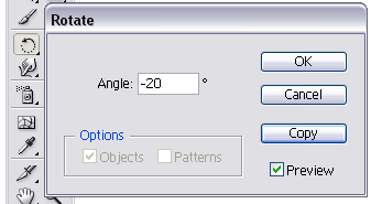
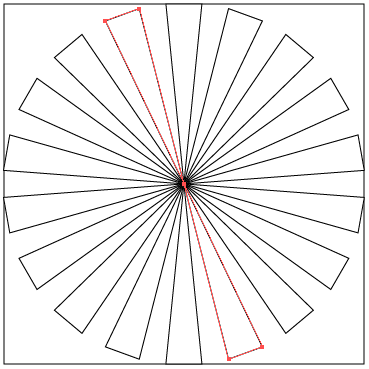
Press Command/Ctrl + D seven times. You should have a similar shape like below:-
Step 6
Ok, now we would like make it really look like a sunburst. Grab your Direct Selection Tool or just press A. Select a single point of our shape. Then, click and drag the point until it "snapped" on our big rectangle line.
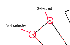
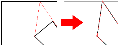
Do the same to the other points until you get something similar like below:-
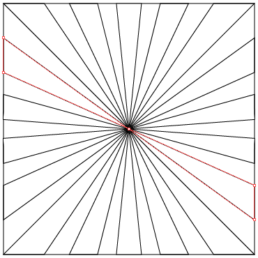
Step 7
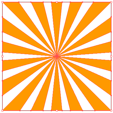
Ok, now, select all of our shape and fill it with Orange color, #FF9900 with no stroke color.
Drag this sunburst shape to the Symbol palette (Shift+F11). Click the circle-triangle button and Save Symbol Library. Just save it as orangesunburst.ai.
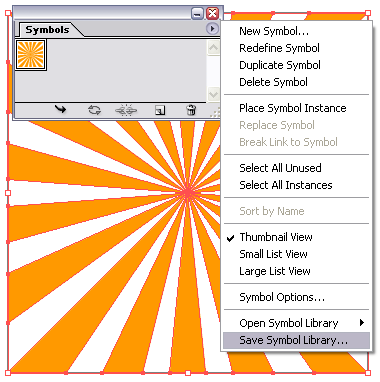
Wow! Right now you already have a vector sunburst shape and guess what, you’ll never need to recreate them. To use it, just Open Symbol Library, locate the orangesunburst symbol file. Drag the symbol to your artboard. And of course, you can change the color, resize them to make it bigger or even smaller.
Continue to next step to give this sunburst a grunge effect.
Note: Just delete the other symbols that you don’t use. Don’t worry about it.;)
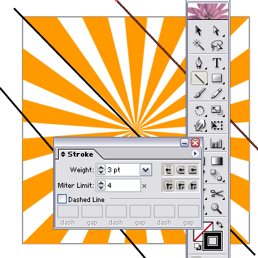
Step 8
Using the Line Segment Tool (/), draw 3 lines across our sunburst and set Weight: 3px on Stroke palette (F10). Apply black color on it and without fill color. See image below:-
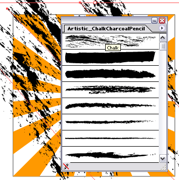
Select all our 3 lines by using Shift key. Open the Brushes palette (F5). Then click the small triangle button on the right side > Open Brush Library > Artistic_ChalkCharcoalPencil. Click on the brush that called Chalk (the first one, on top) to apply the brush effect.
Step 9
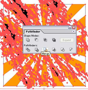
While all the lines was still on selected, go to Object > Expand Appearance.
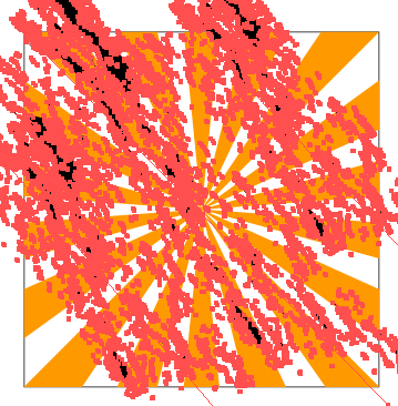
Then, select all shapes including our sunburst. Go to Pathfinder palette (Shift + F9) and click Merge.
After that, go to Object > Expand and just click OK. Ungroup them. Object > Ungroup (Command/Ctrl + Shift + G). You might repeat this step (ungroup) 2 or 3 times until it cannot be ungroup anymore.
Step 10
Click anywhere on the artboard to deselect all shapes. Then, select some part of the black shape.
Go to Select > Same > Fill Color. Press Delete key.
Congratulation! Now you’ve created the grunge sunburst. Repeat Step 7 to save this shape as your symbol.
Step 11
Now we gonna apply this grunge effect on text. Lock Layer 2. Create new layer.
Go to the Type Tool (T) and type anything on the artboard. Press Command/Ctrl + T to bring out the Character palette. I used Verdana, Bold, 60pt. Fill it with green color, #1E7D27 with no stroke.
Right click the text > Create Outlines.
Repeat Step 8, 9 and 10. In step 8, just draw one line instead of three. And make sure the line and the text has a different color.
This is what I get:

Step 12
Last, but not least. Using the Rectangle Tool (M), draw another rectangle for our text background. Apply a black color for both fill and stroke color. Go to the Brushes palette (F5) once again and apply the Chalk Scribble brush on the default Brushes palette. Right click the rectangle > Arrange > Send to Back or just press Command/Ctrl + Shift + [.
Be creative. Rotate our text or play around using the other colors, gradient and so on. Besides, you also can add another text, shapes or anything that suits your design.
And..umm..one more thing. Remember our Layer 1? Unlock that layer and fill it with red color, #970F00 (or any color) with no stroke color. Done.
Our final result:
Software: Adobe Illustrator CS
Step 1
Create a New Document with 500px x 500px setting. Select RGB Color for Color Mode.
Go to View > Snap to Grid (Shift + Command/Ctrl + ").
Step 2
Select the Rectangle Tool or press M and click once anywhere on the artboard. You’ll see a popup window. Enter Width: 400px, Height: 400px. Fill it with a white color and a black stroke color.
Align our rectangle to the center of our artboard using the Align palette (Shift + F7). Make sure you select the Align to Artboard in order to make it work.
Go to the Layers palette (F7) and lock Layer 1. Create new layer.
Step 3
Repeat Step 2 to draw another rectangle. Enter Width: 40px and Height: 400px. Also, align it to the center. And this time just apply a black stroke color on it without a fill color.
Step 4
Go to Effect > Distort & Transform > Free Distort…What we're trying to do right here is to switch the position of our bottom-left point and the bottom-right point. To do this, click and drag the bottom-right point to the bottom-left point. After that click and drag the bottom-left point to the bottom-right point. You’ll have something like this:-
Click OK. Then go to Object > Expand Appearance.
Step 5
Double click the Rotate Tool. Enter Angle: -20 and click Copy.
Press Command/Ctrl + D seven times. You should have a similar shape like below:-
Step 6
Ok, now we would like make it really look like a sunburst. Grab your Direct Selection Tool or just press A. Select a single point of our shape. Then, click and drag the point until it "snapped" on our big rectangle line.
Do the same to the other points until you get something similar like below:-
Step 7
Ok, now, select all of our shape and fill it with Orange color, #FF9900 with no stroke color.
Drag this sunburst shape to the Symbol palette (Shift+F11). Click the circle-triangle button and Save Symbol Library. Just save it as orangesunburst.ai.
Wow! Right now you already have a vector sunburst shape and guess what, you’ll never need to recreate them. To use it, just Open Symbol Library, locate the orangesunburst symbol file. Drag the symbol to your artboard. And of course, you can change the color, resize them to make it bigger or even smaller.
Continue to next step to give this sunburst a grunge effect.
Note: Just delete the other symbols that you don’t use. Don’t worry about it.;)
Step 8
Using the Line Segment Tool (/), draw 3 lines across our sunburst and set Weight: 3px on Stroke palette (F10). Apply black color on it and without fill color. See image below:-
Select all our 3 lines by using Shift key. Open the Brushes palette (F5). Then click the small triangle button on the right side > Open Brush Library > Artistic_ChalkCharcoalPencil. Click on the brush that called Chalk (the first one, on top) to apply the brush effect.
Step 9
While all the lines was still on selected, go to Object > Expand Appearance.
Then, select all shapes including our sunburst. Go to Pathfinder palette (Shift + F9) and click Merge.
After that, go to Object > Expand and just click OK. Ungroup them. Object > Ungroup (Command/Ctrl + Shift + G). You might repeat this step (ungroup) 2 or 3 times until it cannot be ungroup anymore.
Step 10
Click anywhere on the artboard to deselect all shapes. Then, select some part of the black shape.
Go to Select > Same > Fill Color. Press Delete key.
Congratulation! Now you’ve created the grunge sunburst. Repeat Step 7 to save this shape as your symbol.
Step 11
Now we gonna apply this grunge effect on text. Lock Layer 2. Create new layer.
Go to the Type Tool (T) and type anything on the artboard. Press Command/Ctrl + T to bring out the Character palette. I used Verdana, Bold, 60pt. Fill it with green color, #1E7D27 with no stroke.
Right click the text > Create Outlines.
Repeat Step 8, 9 and 10. In step 8, just draw one line instead of three. And make sure the line and the text has a different color.
This is what I get:
Step 12
Last, but not least. Using the Rectangle Tool (M), draw another rectangle for our text background. Apply a black color for both fill and stroke color. Go to the Brushes palette (F5) once again and apply the Chalk Scribble brush on the default Brushes palette. Right click the rectangle > Arrange > Send to Back or just press Command/Ctrl + Shift + [.
Be creative. Rotate our text or play around using the other colors, gradient and so on. Besides, you also can add another text, shapes or anything that suits your design.
And..umm..one more thing. Remember our Layer 1? Unlock that layer and fill it with red color, #970F00 (or any color) with no stroke color. Done.
Our final result:
That’s all for today and hope you guys enjoy this tutorial. Yeahhh!!! :)
Saturday, April 5, 2008
Saturday, March 29, 2008
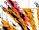
Vector Illustration - Glory days

[ Download | 1024x768 ]
Hmm..this is the very first time I designing something like this. I know its not looking very good though. I visited a lot of design blog/website everyday and see their artworks including these funky design. I told to myself -> Ohh..that was really easy.
But when I'm trying to design it by myself, my head start spinning in the air. Yes, it quite hard if you're a newbie like me. You've to consider a lot of things - elements to use, colors, shapes, placement, typography, theme and so on..
So in this illustration, I've use the sunburst shape as the background and the purplish colors as well. Maybe in the next tutorial section I will tell you how do I created the sunburst effect. So don't forget to get a free updates via my blog feed or email. Hehe..
Vector illustration details:-
Name: Glory Days
Type: Vector Illustration
File Format: JPEG
Dimensions: 1024 x 768
Theme: Funky
File size: 707 KB
Date created: March 29, 08
Software: Adobe Illustrator CS
Color: Purple, Red, Orange, Yellow, White
Background Color:
- HEX: #330033
- RGB: 51, 0, 51
Extract the file using WinZip.


